Solid-Color Rugs
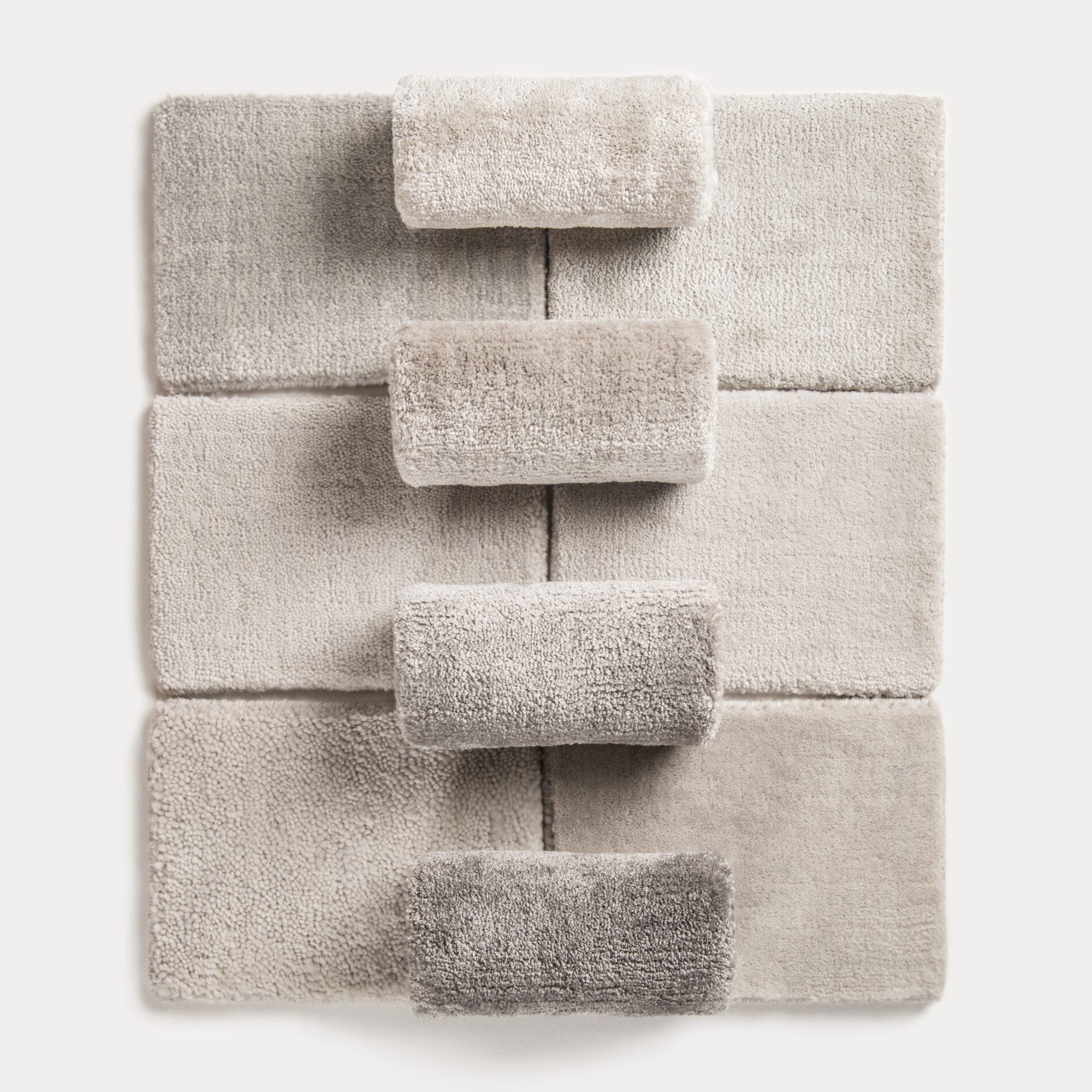
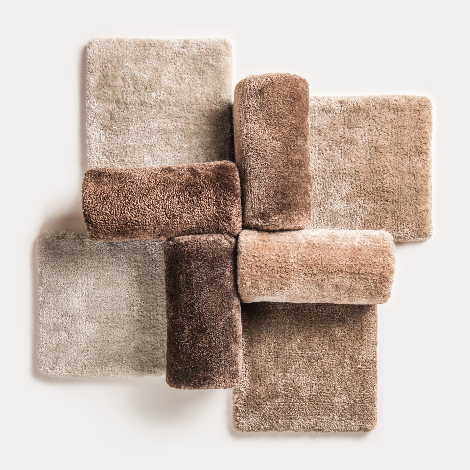
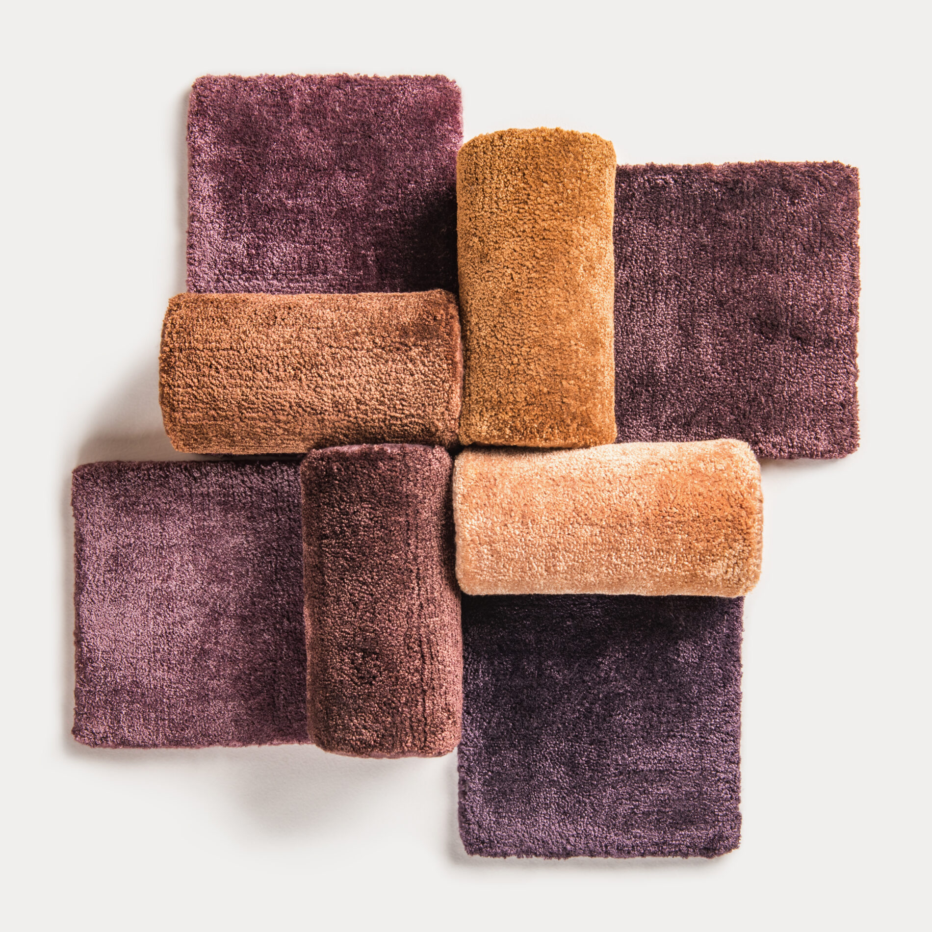
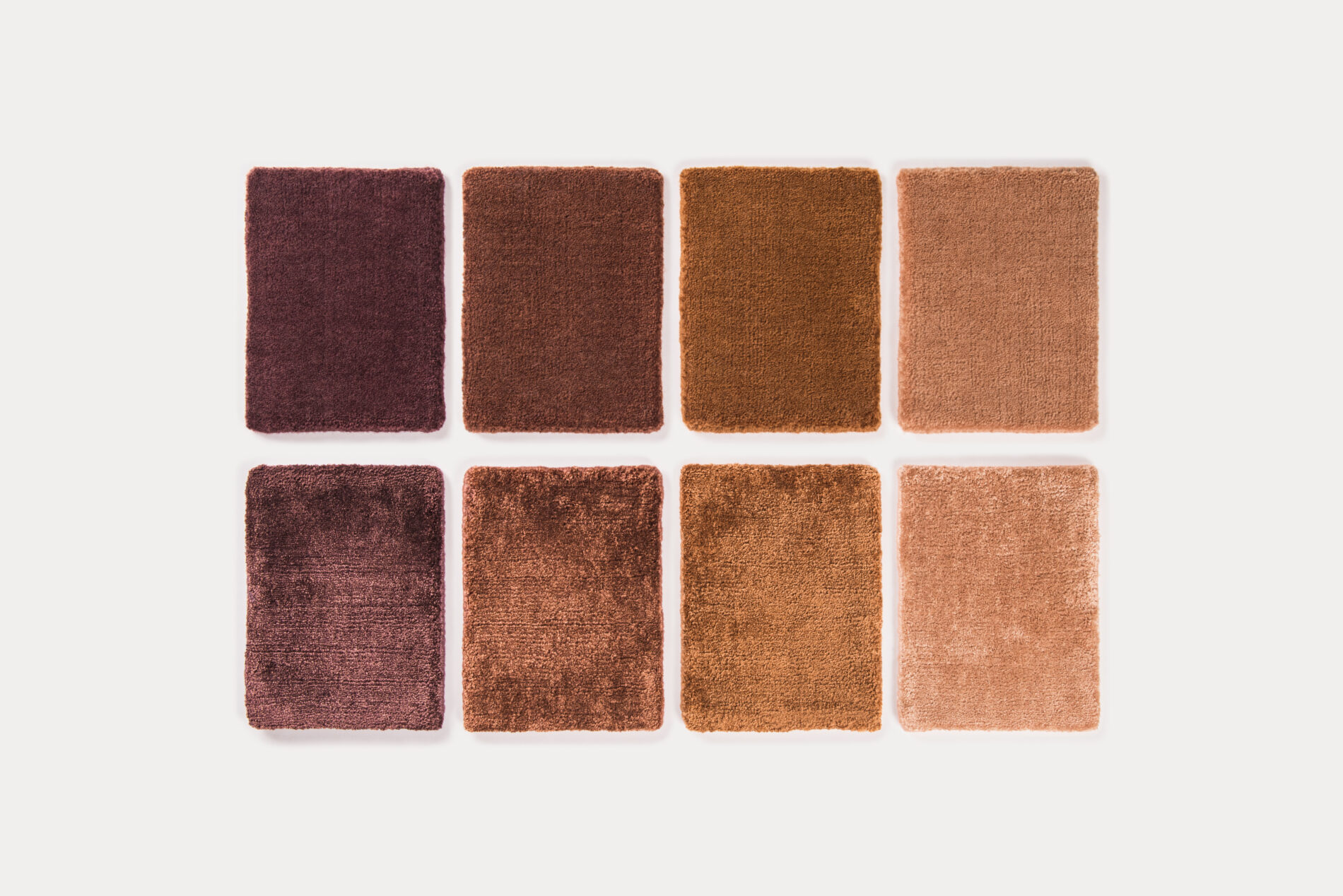
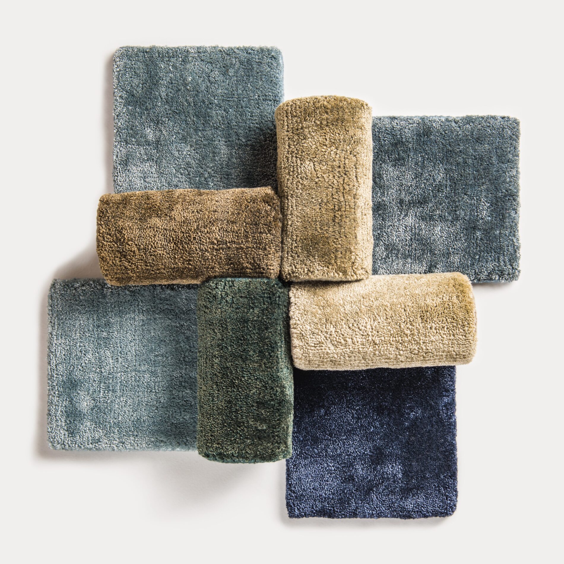
The Tapis Rouge Milan's color palette was developed based on the analysis, studies and recommendations of architects and designers.
The concept of the palette originated from the idea of integrating interior and carpet colors through common color codes used by interior design professionals and private clients.
The Tapis Rouge Milan team paid particular attention to the choice of colors and shades. The range includes complex and intense colors that soothe rather than excite, evoking complex and meaningful emotions. These colors require long perception and satisfy the need for refined sensations.
Our experts provide consultations via video call or in our showroom. It's important that your color consultant can assess your space's lighting, architecture, and features, even if they cannot be present in person. We will offer a 15% discount, which you can use within six months. The Monochrome Solid Plane Rugs Collection is available in 8 materials.
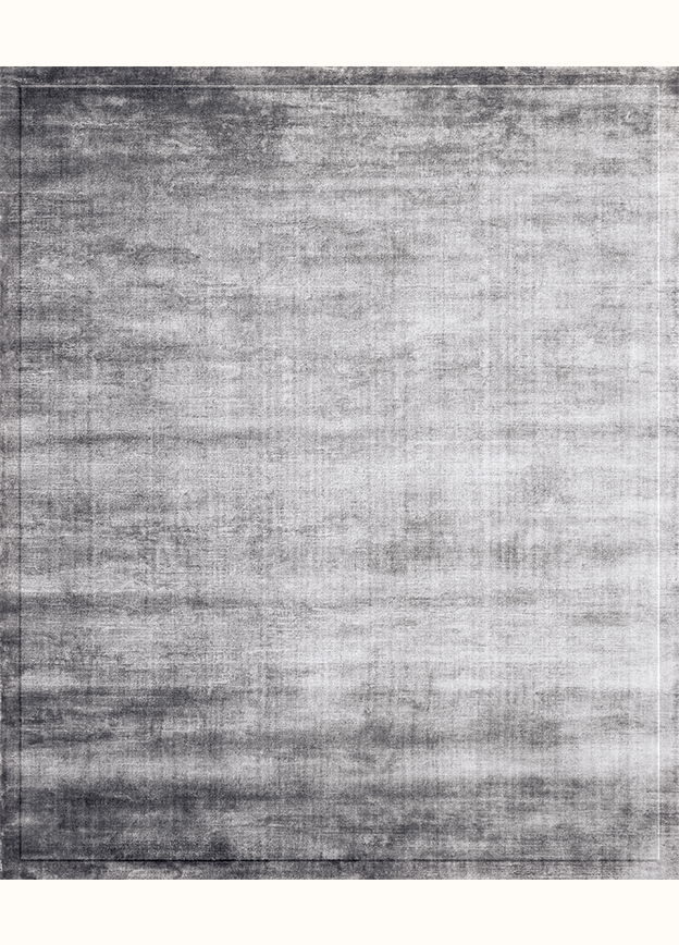
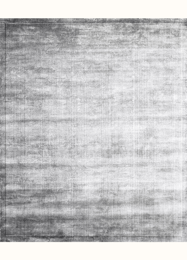
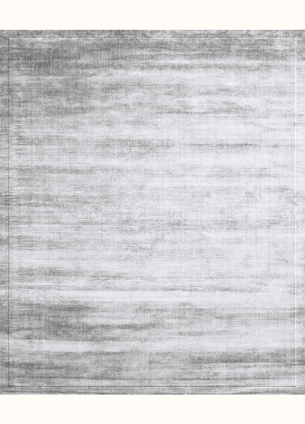
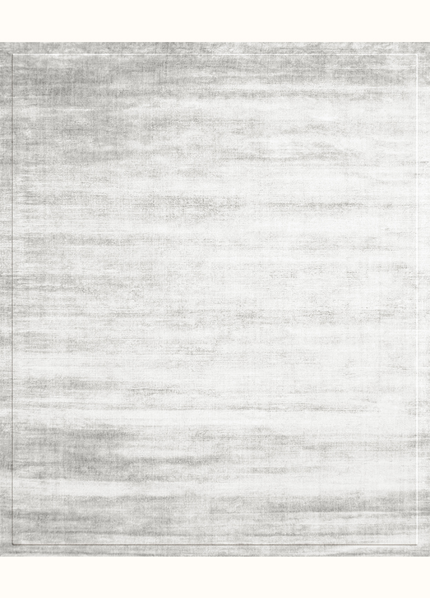
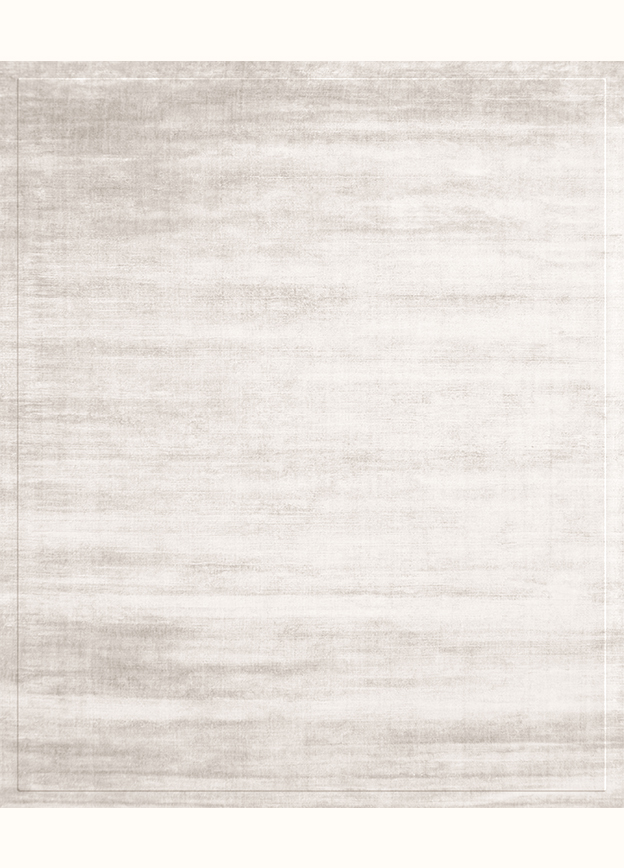
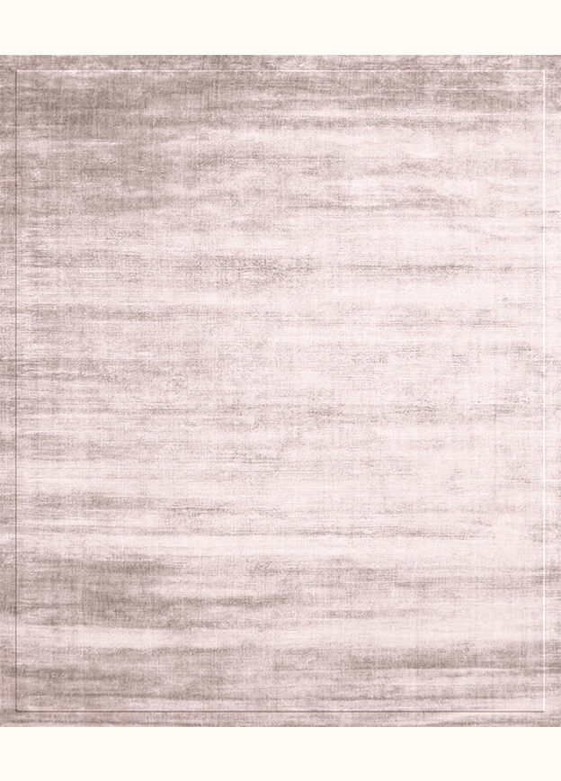
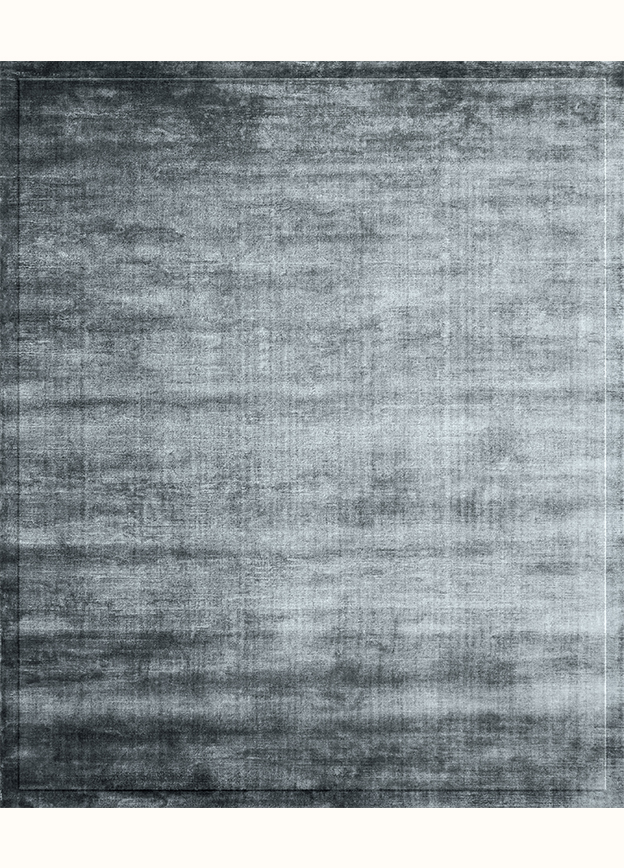
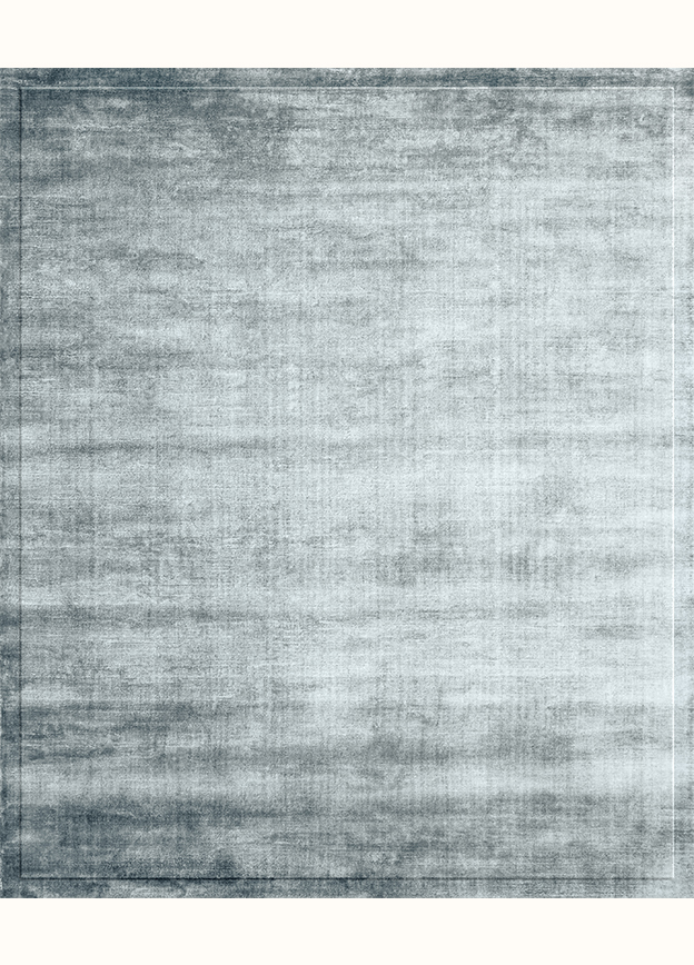
GREY
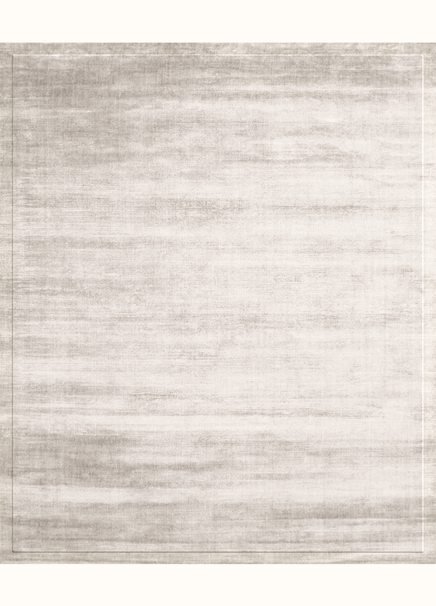
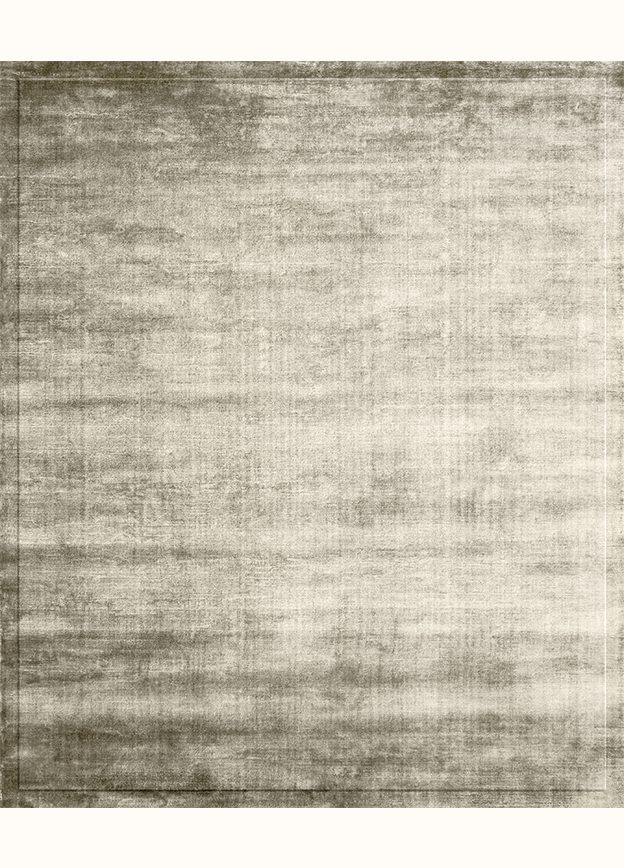
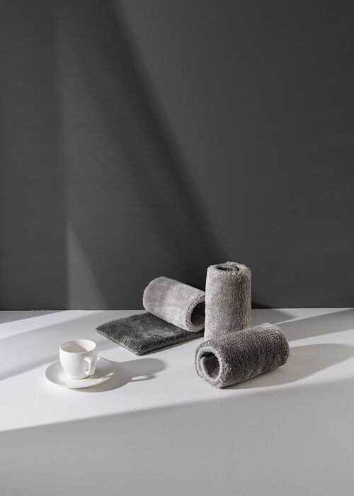
The balanced union of black and white creates Gray. Of course, gray can convey neither movement nor sound. Gray is silence and stillness, but this stillness differs from that of green, which arises from two active colors—yellow and blue. Therefore, gray symbolizes a stillness where life resonates with a medium tone, flickers and lives.
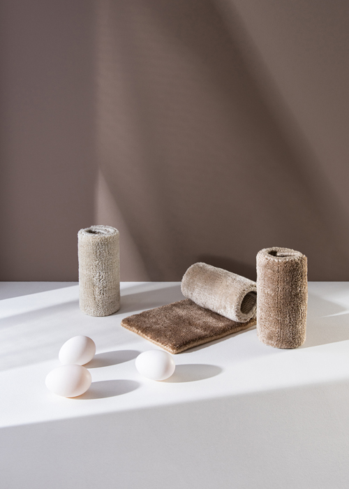
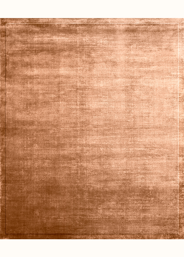
BEIGE
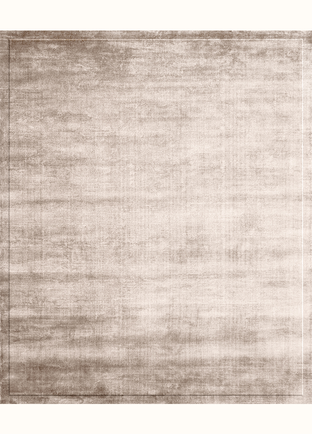
Beige is a shade of subtle elegance and vibrant energy. It creates a soft, cozy feeling, radiating warmth and comfort. Due to its versatility, beige is perfect for any setting, adding timeless, natural beauty that harmonizes with various approaches, from modern minimalism to classic elegance, making it an ideal choice for expressing understated sophistication.
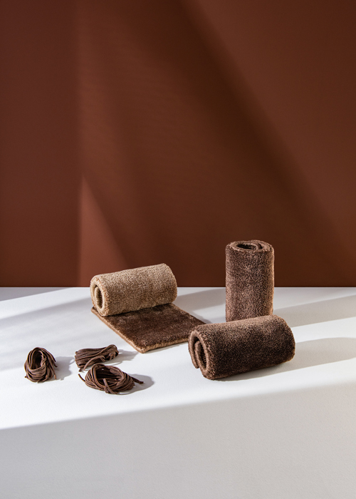
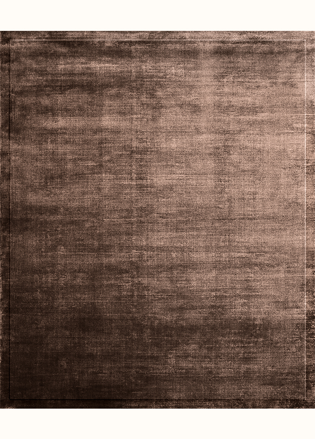
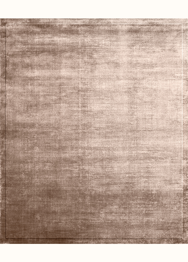
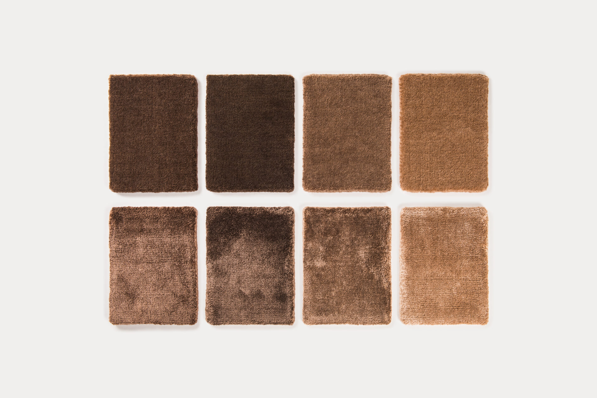
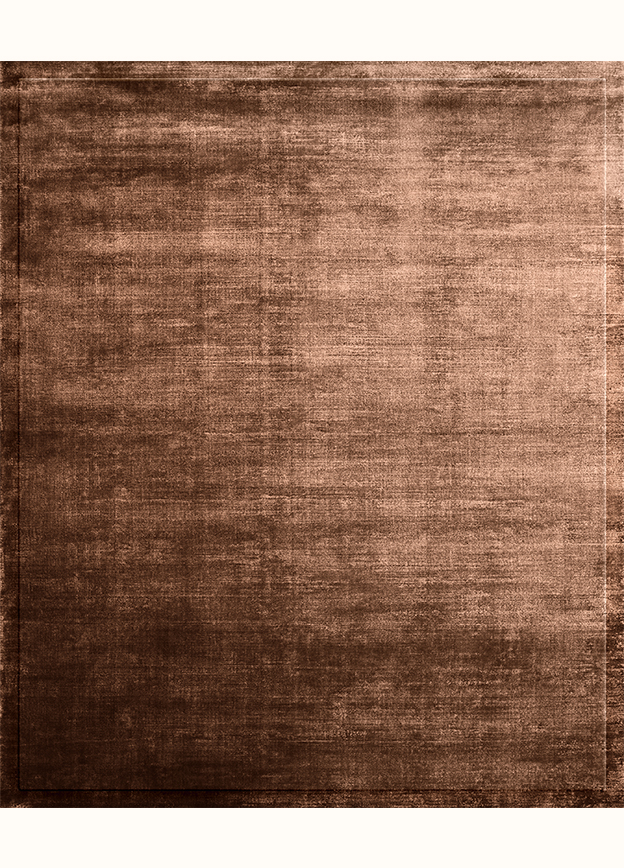
BROWN
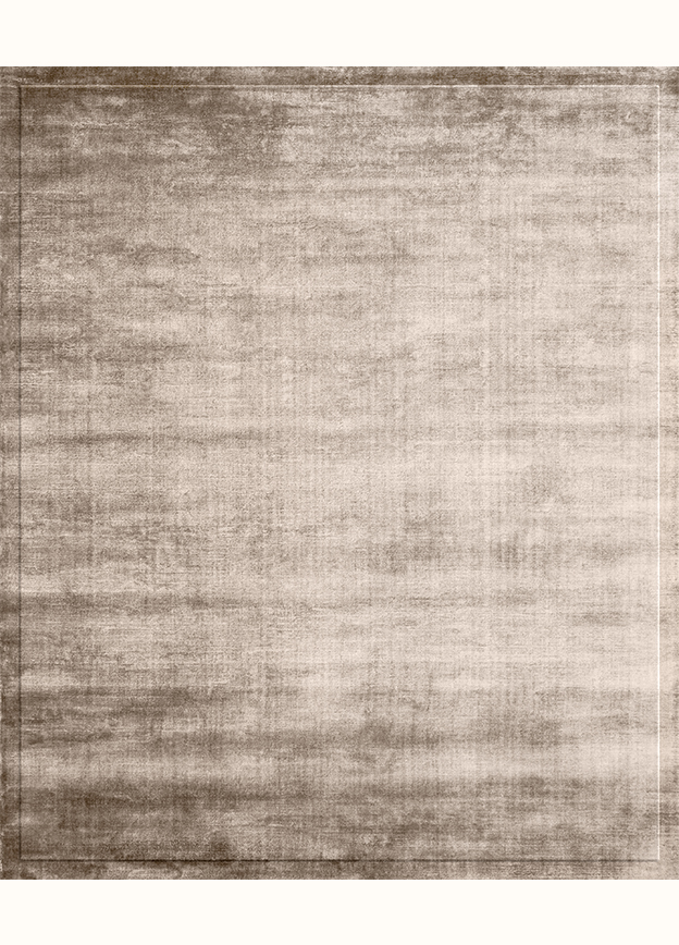
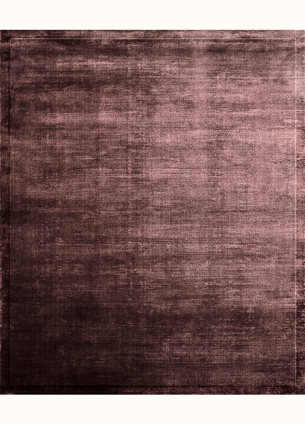
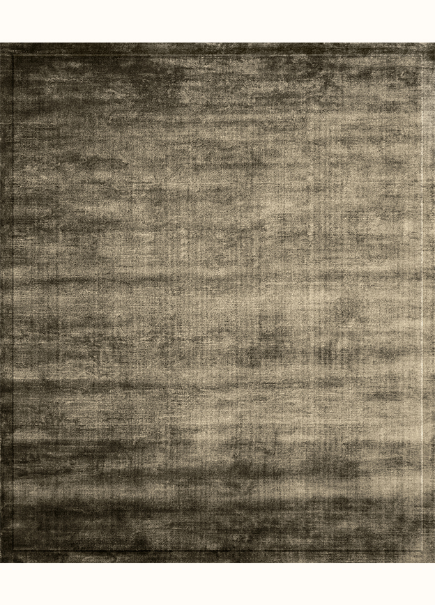
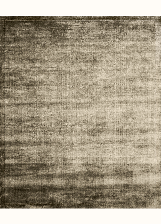
Brown is a rich, warm color associated with earth and stability. It symbolizes grounding, reliability, and confidence, bringing a sense of warmth and security. Brown is timeless, with a depth and richness that highlight its natural connection to the earth and organic materials, making it a color that resonates with nature's essence.
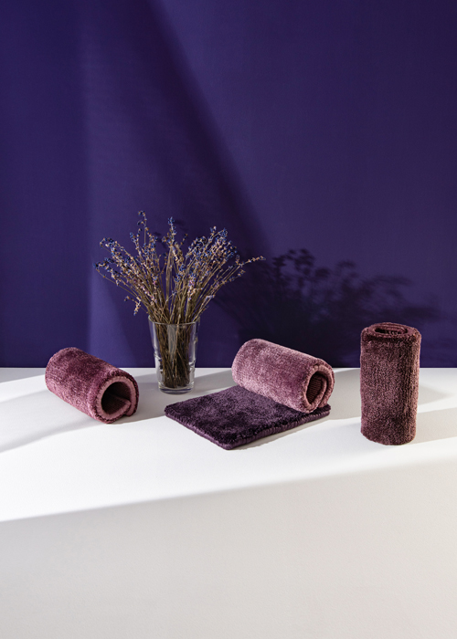
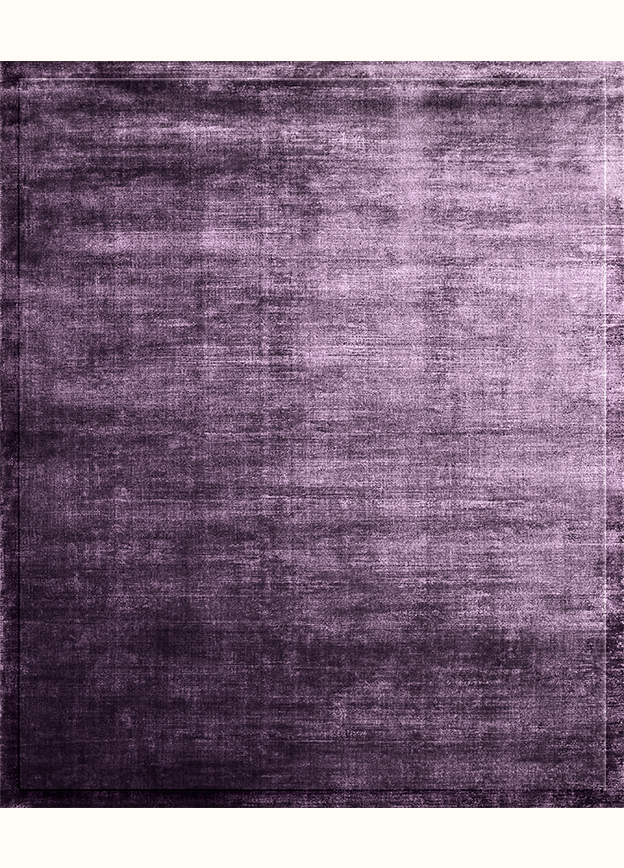
VIOLET
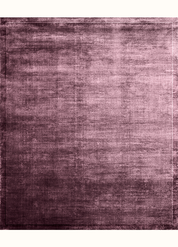
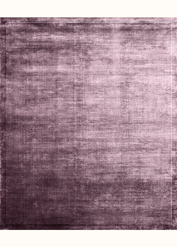
Violet is an intense, fresh color that embodies spirituality and mystique. It symbolizes the connection between the physical and the spiritual, often associated with deep contemplation and introspection. Violet inspires creativity, encourages meditation, and fosters a sense of inner peace. Its rich hues evoke a sense of mystery, making it a color of profound meaning and emotional depth.
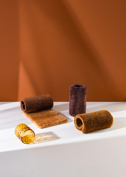
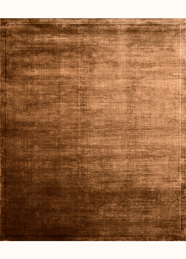
ORANGE
Orange is a warm, dry, and powerful color, symbolizing birth and sunset. It radiates energy and vitality, awakening enthusiasm and creativity. Orange is associated with optimism and warmth, bringing any space to life with its vibrant presence. This color inspires and fills life with activity and joy, making it truly invigorating.
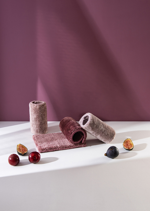
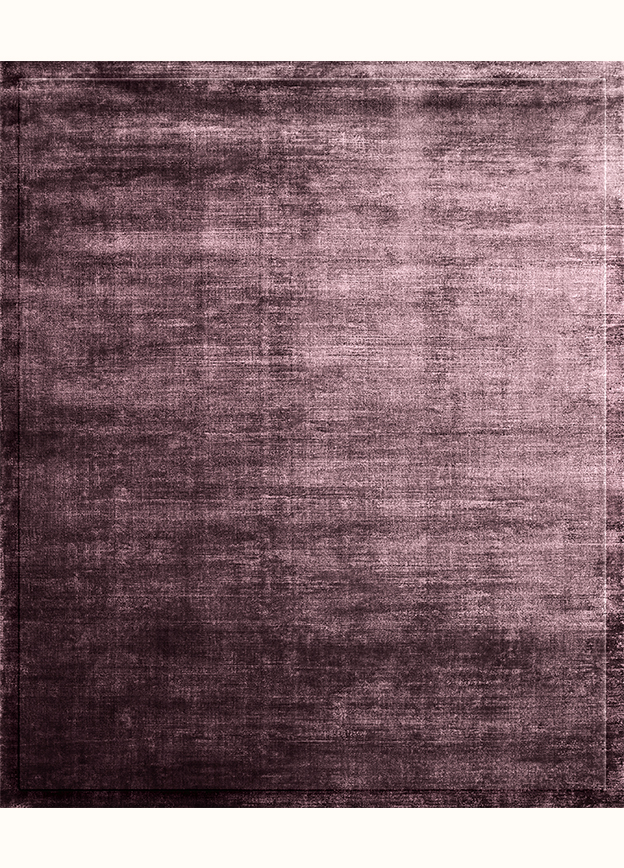
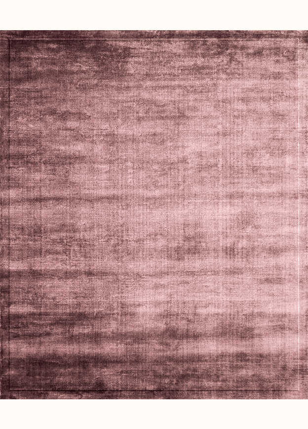
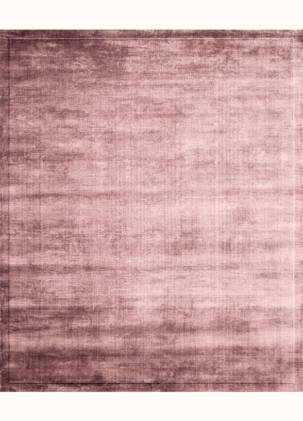
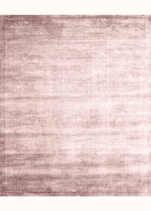
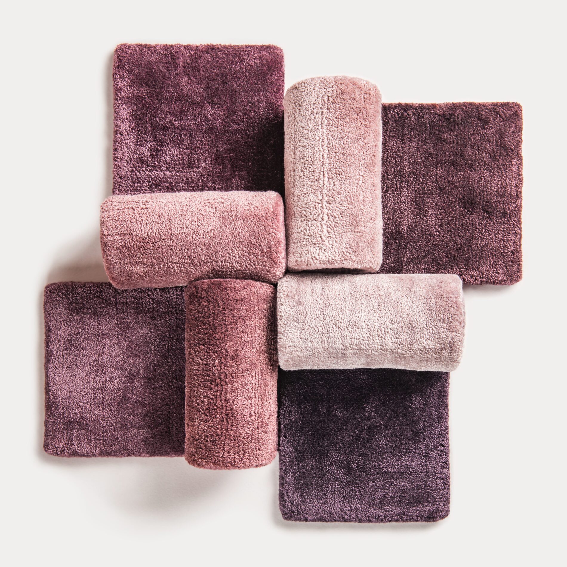
ROSE
Rose-Deep is a rich, vibrant shade that blends the softness of rose with the intensity of deep red. It radiates warmth, passion, and vitality, exuding elegance and romance. This luxurious color captures the essence of blooming roses while adding depth. It pairs beautifully with warm tones like deep oranges and golds, creating a harmonious palette.
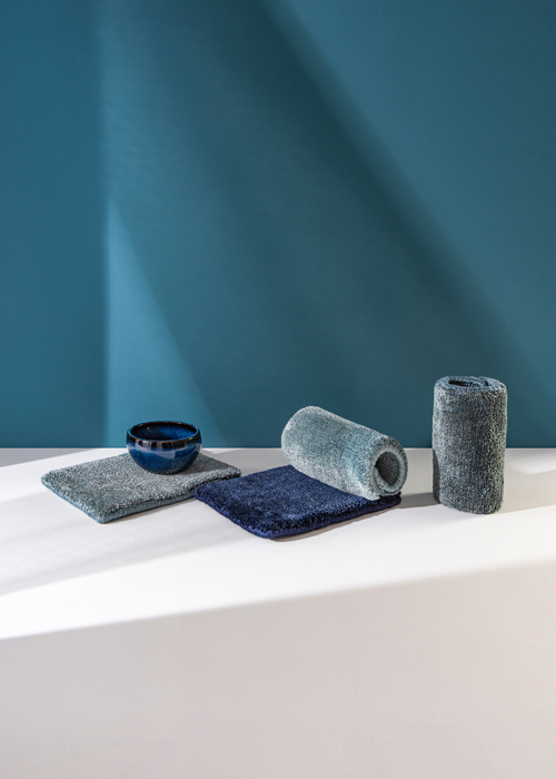
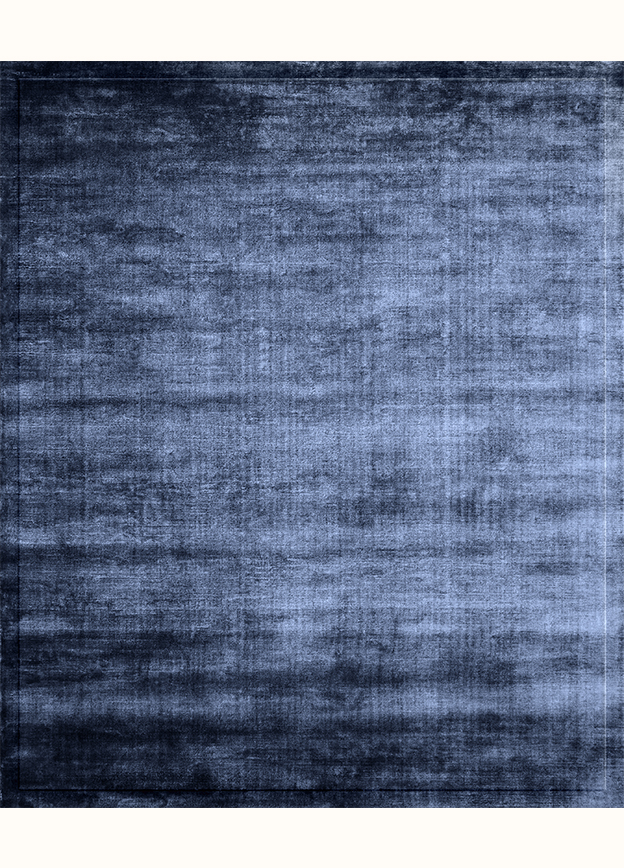
BLUE
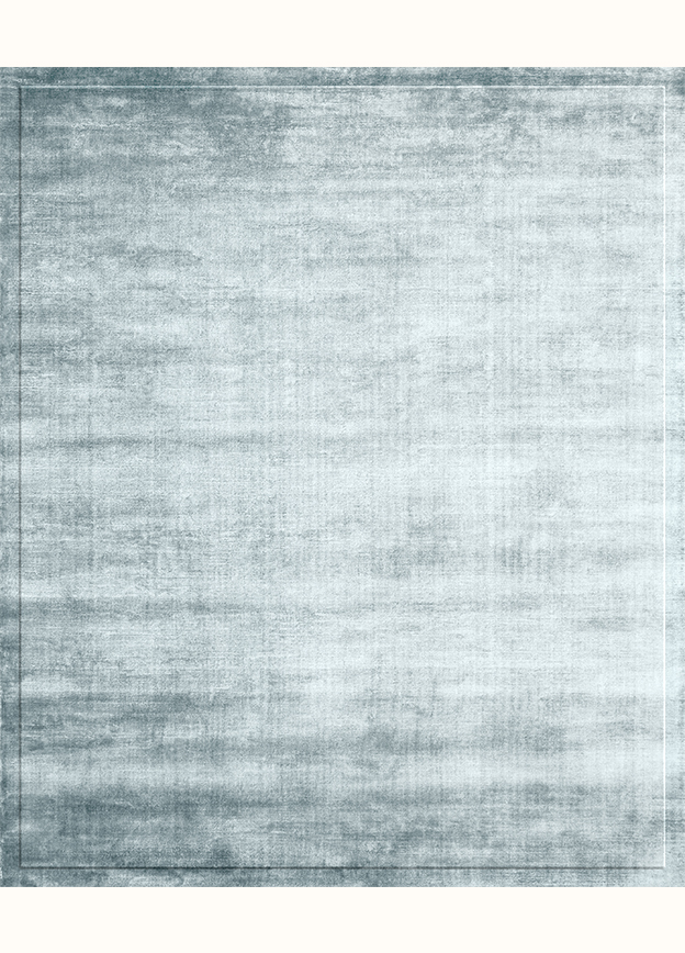
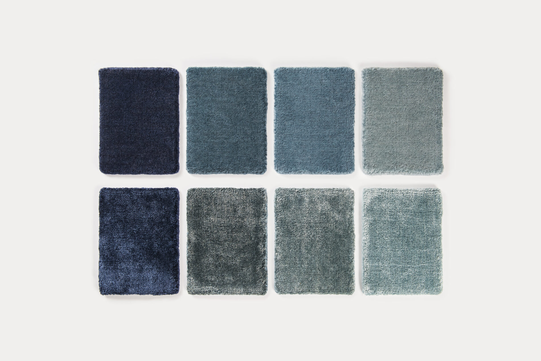
Blue evokes depth and infinity, growing more profound and serene as it darkens, awakening a desire for purity and transcendence. A very dark blue is relaxing, but near black, it takes on a hint of sadness. As blue lightens, it becomes distant and detached, eventually reaching a state of calm silence in white.
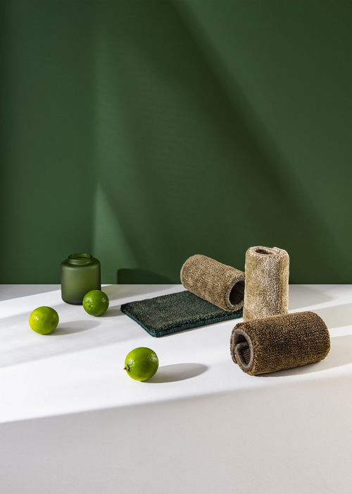
GREEN
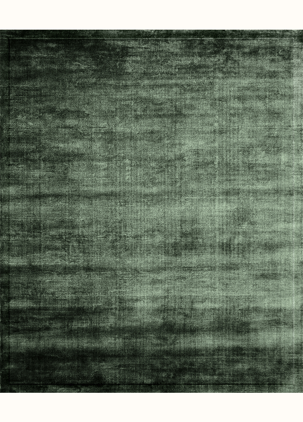
Green is a cool, moist, and calm color, symbolizing life and stability. It evokes the freshness of nature, from lush forests to vibrant meadows. Associated with growth, health, and renewal, green brings a sense of balance and harmony. Its tranquil, grounding presence reminds us of the earth's steady rhythm and the vitality of life.

